Color Essentials with Williamsburg Handmade Oils, Part 1
Amy Shawley Paquette
On Wednesday June 10, I had the opportunity to do a Facebook Live presentation on the Williamsburg Oils page, if you missed it I’ve embedded the video below. The talk was part one of two on color essentials in the Williamsburg line and focused on options for color mixing…
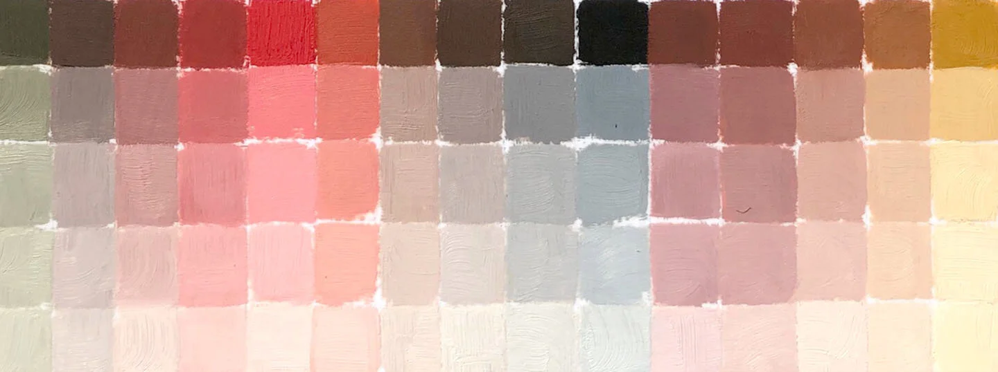
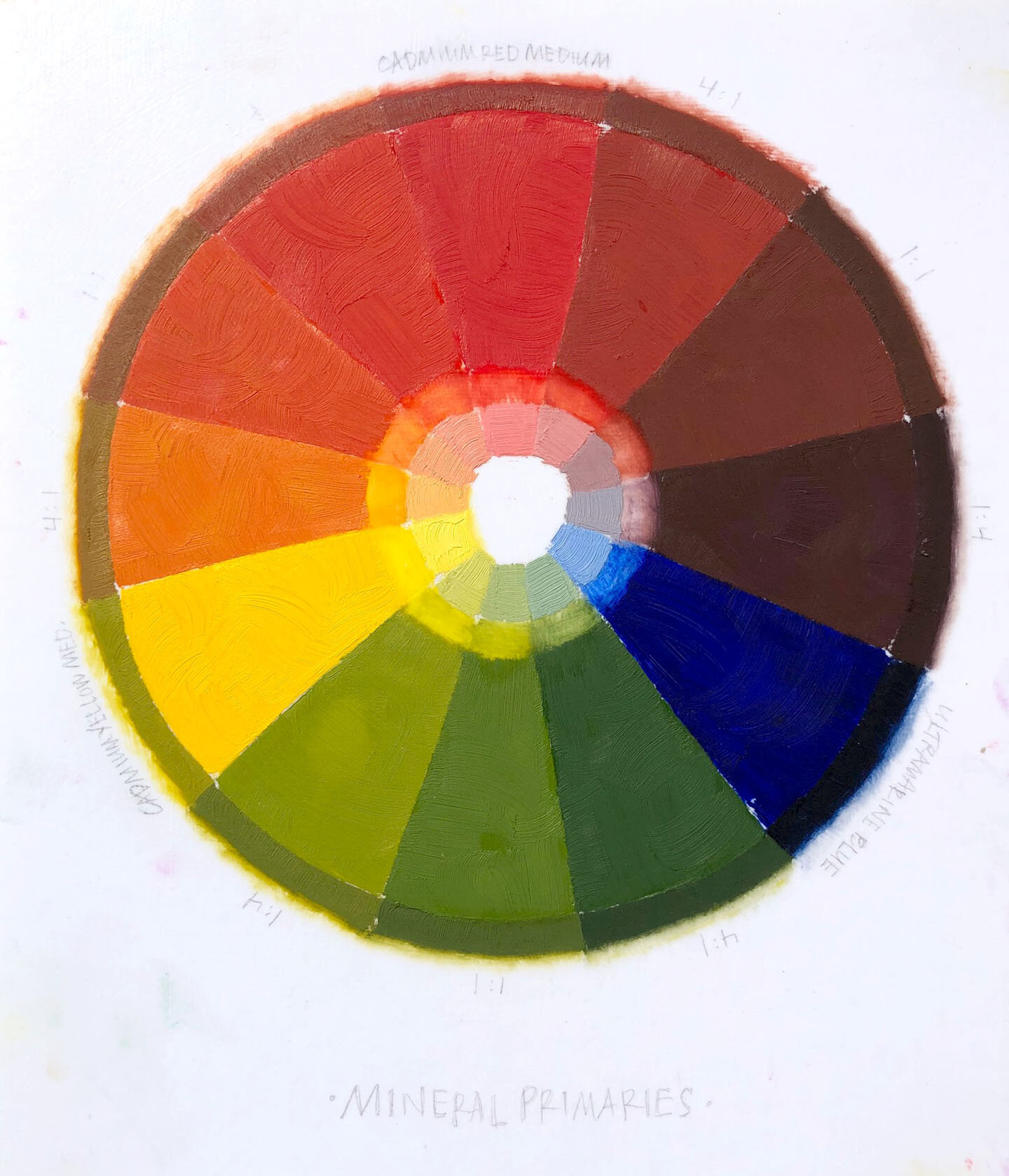
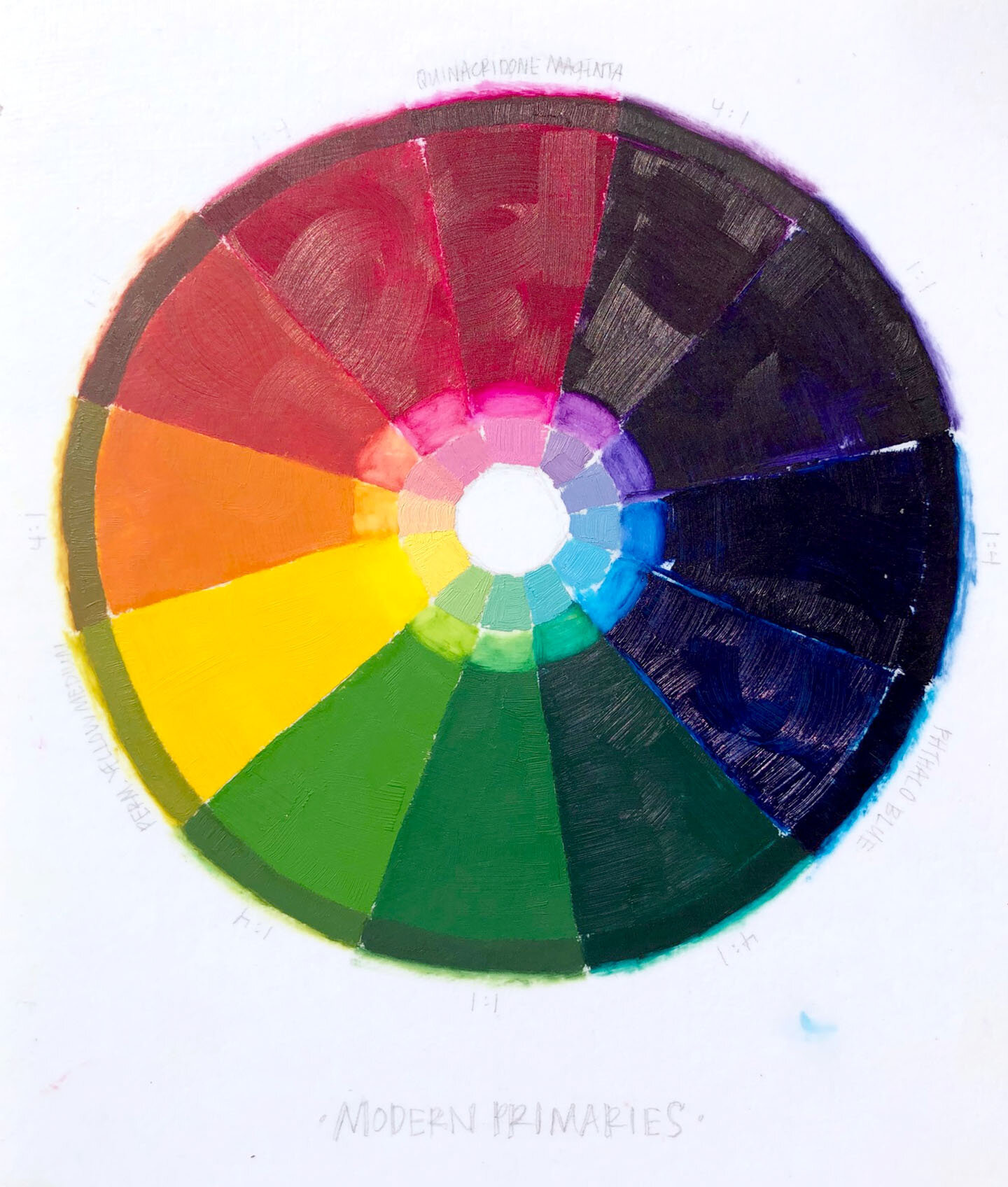
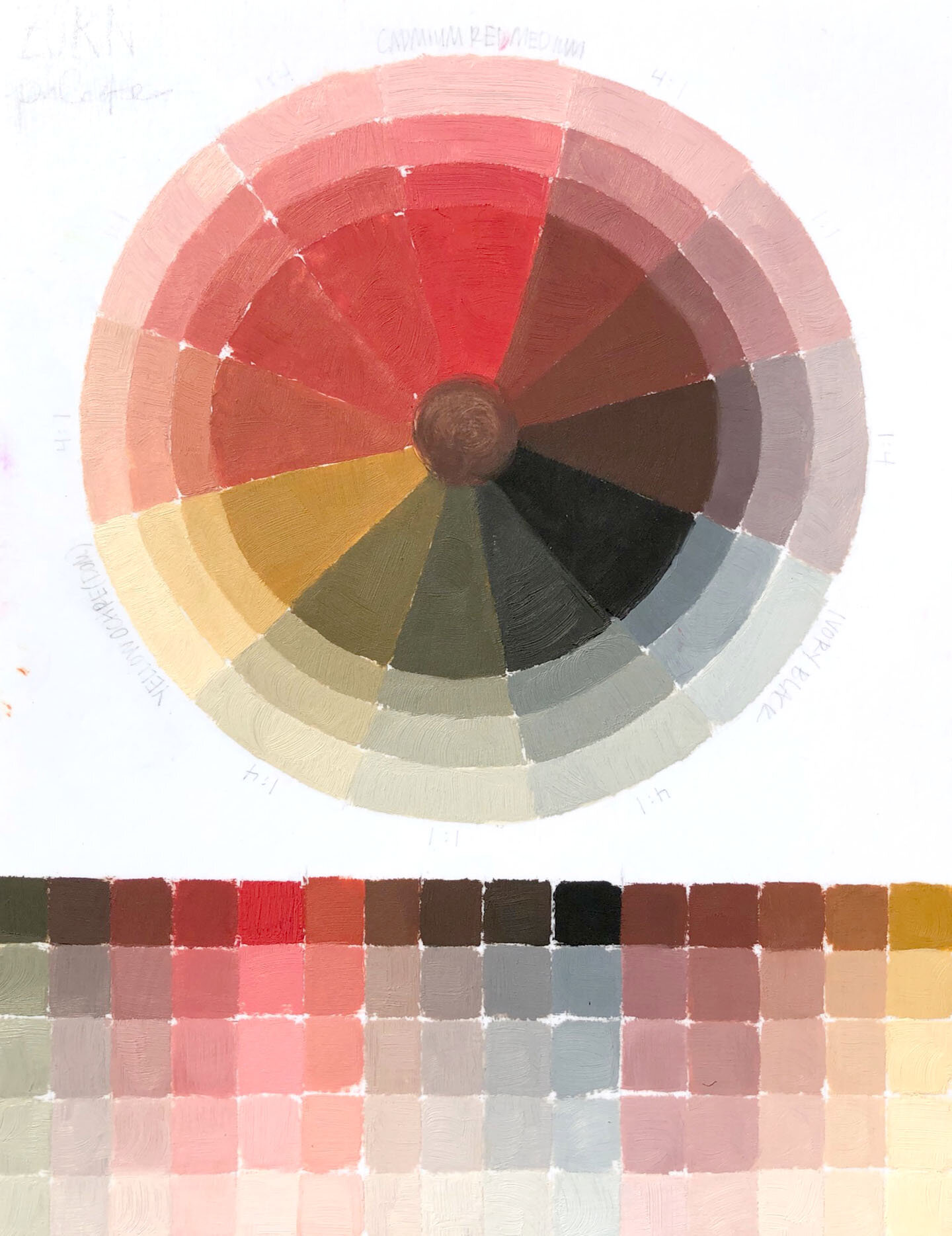
I mentioned in the video that I would share photos of my color wheels here in the blog, those are in slideshow below and show three different options for a trio of primaries plus Titanium White.
Mineral Palette:
Cadmium Red Medium, Cadmium Yellow Medium, Ultramarine Blue - these colors produce earthy, muted, low chroma mixtures that dry to a matte finish.
Modern Palette:
Quinacridone Magenta, Permanent Yellow Medium, Phthalo Blue - these color make vibrant, high chroma mixtures that dry to a somewhat gloss finish (not as glossy in oil as they are in acrylic)
Zorn Palette:
Cadmium Red Medium, Yellow Ochre (Domestic), Ivory Black - this palette was popularized by Anders Zorn and artists over time have shifted some of the color spaces to alter it slightly (try googling Zorn Palette and see what comes up, it’s lovely)
With my nature-inspired work, I find a place for all of these mixtures and more, so I’ve simplified my palette to a double primary system (shared in the video - a warm and cool of each primary) which includes these colors:
Cadmium Red Medium (W), Quinacridone Magenta (C), Cadmium Yellow Medium (W), Cadmium Lemon (C), Ultramarine Blue (W), Phthalo Blue (C)
+ Add Titanium White, Yellow Ochre (Domestic), and Ivory Black
This is the palette I suggest to all of my oil painting students and works great for painters of all levels!
Be sure to mark your calendars for Wednesday June 24 at 2pm EST, I’ll be back on the Williamsburg Facebook page for Color Essentials Part 2 which I dive into more specialty colors like iridescents, interference, blends, Italian earths, and more!