Watercolor Essentials
Amy Shawley Paquette

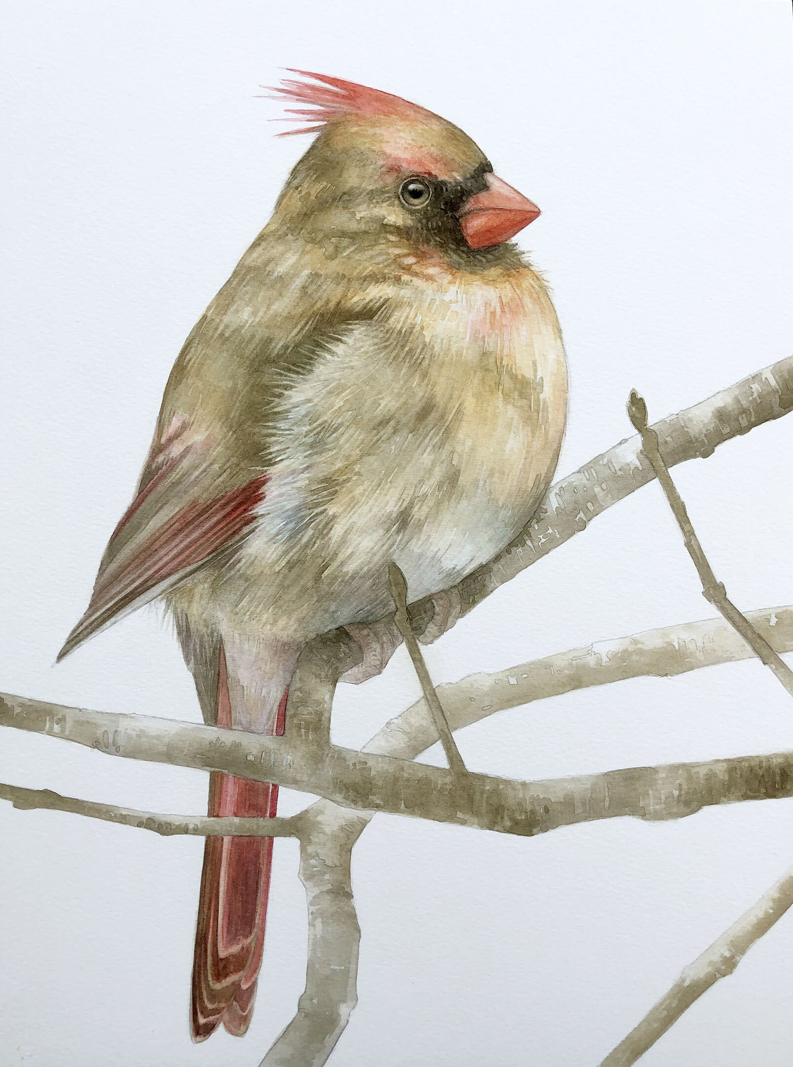
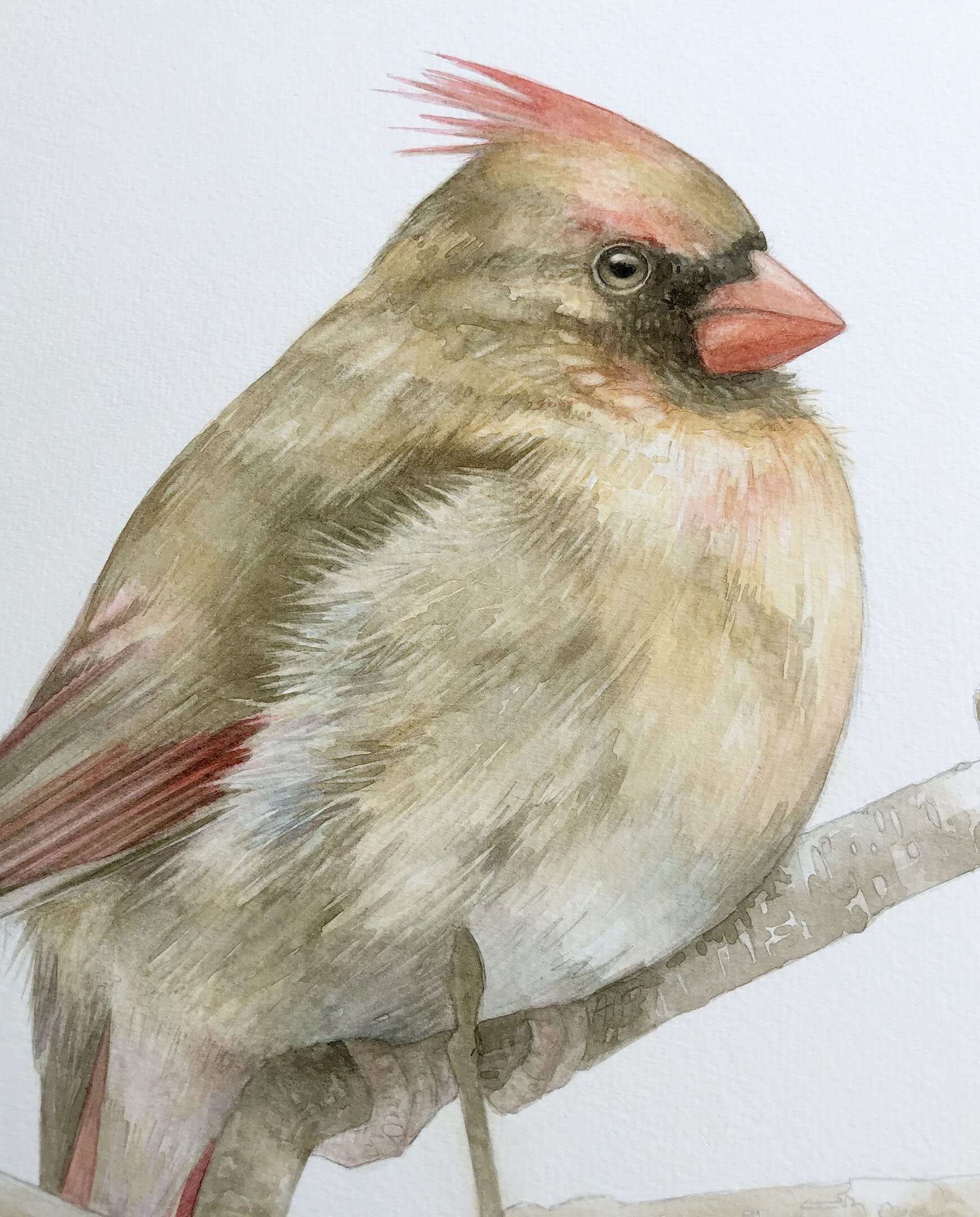
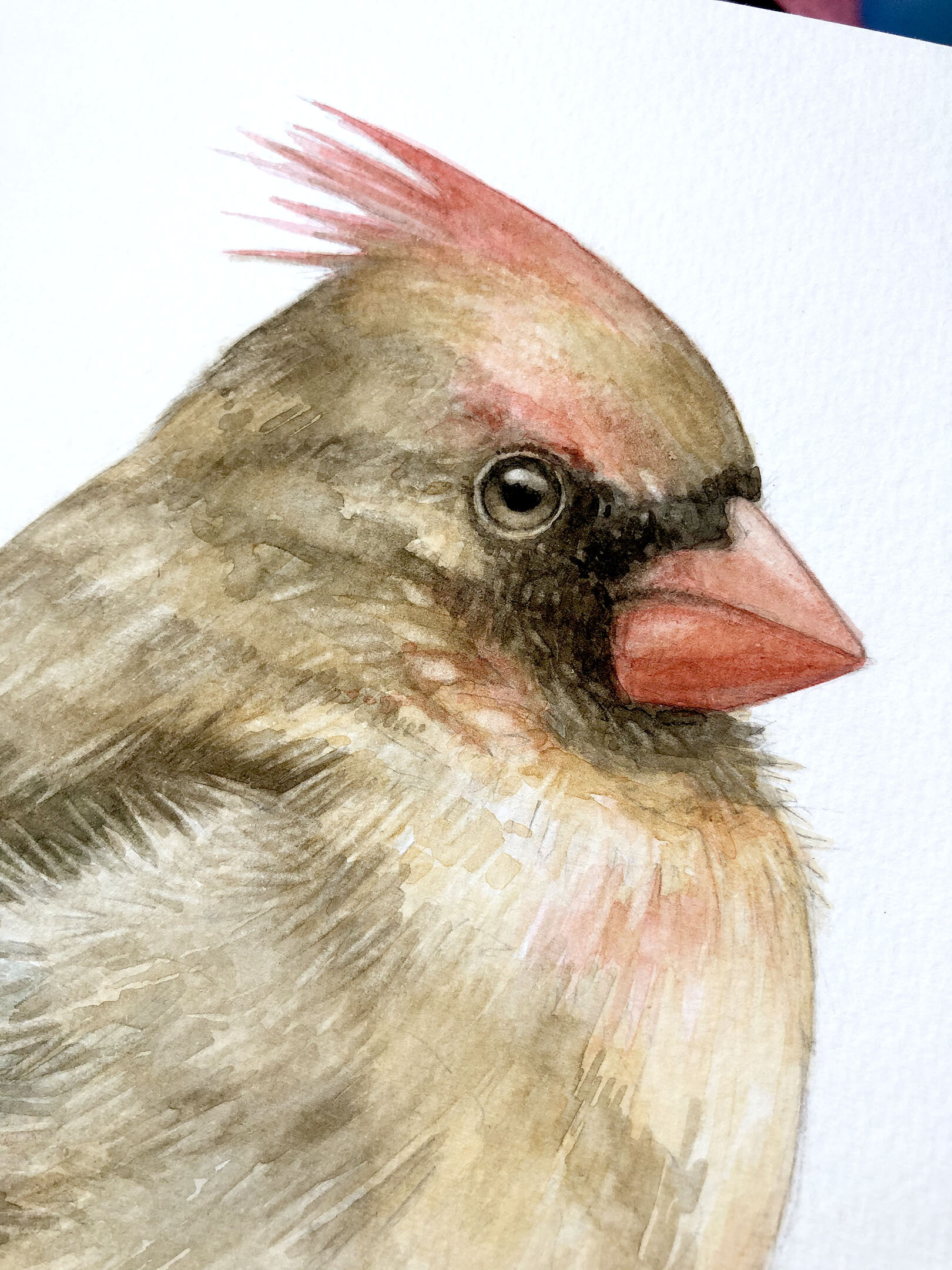
For my most recent Facebook live demo, I thought it would be fitting to share a few watercolor essentials since I’ve been working on a new series of backyard birds this week using QoR! I chose five things from my watercolor process and presented them live, below is the video along with the summary of what I covered…
Start with a Graphite Drawing
When I paint in watercolor, I enjoy having a visible graphite drawing underneath my color. I stay within the range of a 2H/H graphite…if the graphite is much harder, it’ll gouge the paper/substrate and if too soft it will mix with my color. I made the switch last year from using pencils you sharpen to mechanical pencils (for tighter lines), and there are graphite sticks for them available in my preferred range. I make a pretty detailed drawing, or “map”, so that it is easier to plug in color when I’m ready!

Finished graphite drawing for a male Northern Cardinal.
Plan the Layers
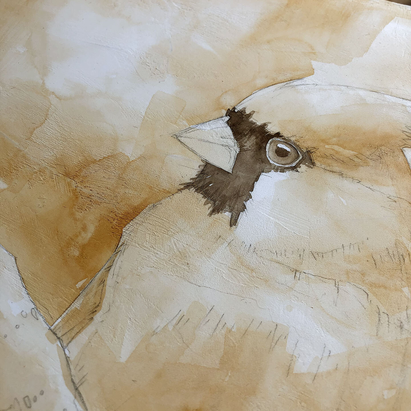
I’m a painter who LOVES detail… even when I endeavor to be loose, I always end up coming back to details. When working in watercolor, I find there is less room for error in the layers (especially when working on paper) so I like to envision how many layers of color I’ll need before diving in and painting. For my birds, I often lay in a warm toning layer first (QoR Raw Sienna), then a darker value neutral layer over that (QoR Sepia solo or mixed with QoR Ivory Black), then will add in brighter colors and deeper saturation in the facial details and feather segments. There are occasions where I layer color without that formula, but it depends on the bird. On paper, I try to keep my layers to about 5-6 passes since I know a) more than that can start to compromise the integrity of the paper surface (ie: paper pilling/shredding) and b) I can finish a painting in fewer layers due to the color intensity of QoR Watercolors. On a substrate other than paper, it is possible I may have more or fewer options for layering…
Explore options for Developing the Surface
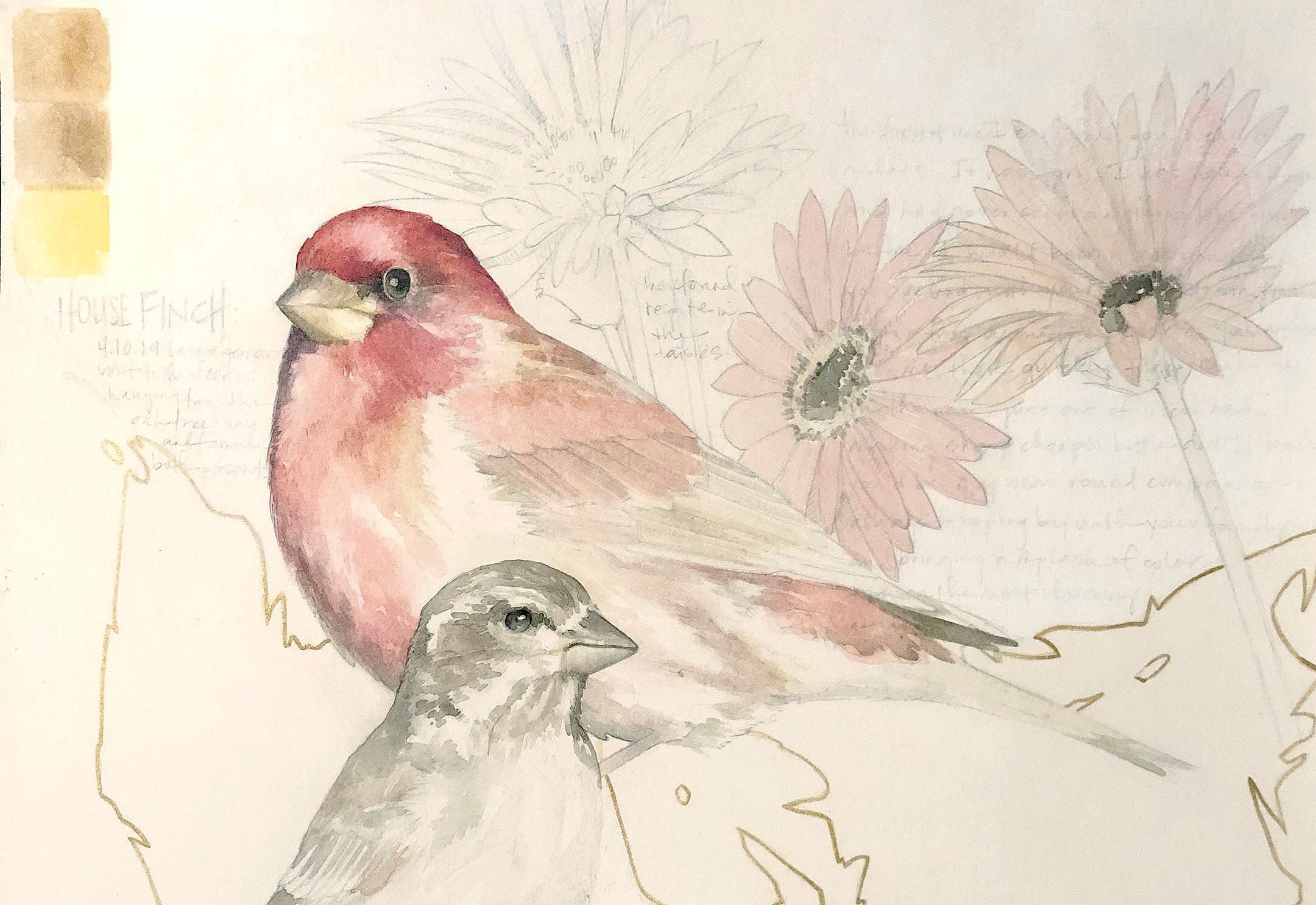
This topic relates to my blog post on customizing your painting grounds - you can paint in watercolor on surfaces other than paper, including acrylic materials that you apply to a canvas or panel. For a deeper dive into a few of these options, see my blog post on QoR Grounds! If you are using an acrylic product as a ground for watercolor (ie: QoR or GOLDEN Grounds), you will need to assess the surface for its absorbency or toothiness and gauge how many paint layers it could accept. Some toothy surfaces like Black Gesso may only respond well to 2-3 paint passes before your color just wants to lift, but other “thirsty”/absorbent products like GOLDEN Fiber Paste or Light Molding Paste may give you 10+ color passes. This greatly broadens the options for what you can paint on, especially if after planning out your layers, you need a heartier substrate! Due to the range of transparency and opacity in the QoR color line, it is possible to paint over darker substrates, very exciting! Below are a couple examples of surfaces I’m working on now - the House Finches are on a hot press watercolor paper that I coated with GOLDEN Matte Medium to protect the fibers from pilling, the Cardinal is just beyond the toning layer and I’m painting over GOLDEN Absorbent Ground…
Subtraction
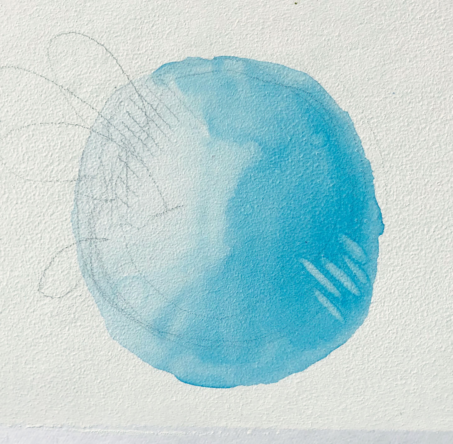
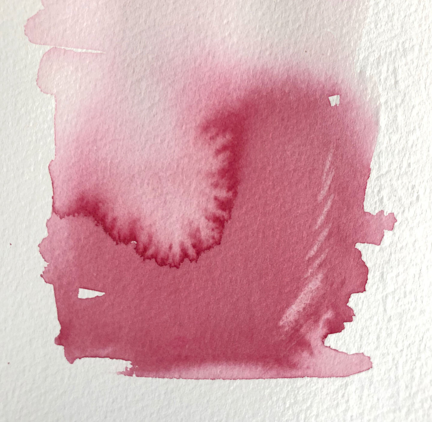
One of my favorite attributes of working in watercolor is the fact that it will lift/reanimate with water after drying. I like to plan for this in my layers and typically subtract color with a slightly water-wet brush as a final touch to create areas of highlight and feather softness in my birds. Some colors lift more easily than others and some surfaces will allow for easier lifting than others. I did a quick demo of subtracting color in my FB live session, photos of those samples are just below. The sample in red was done on watercolor paper and the blue sample was done on QoR Watercolor Ground (which is essentially the same as GOLDEN Absorbent Ground). The QoR Watercolor ground does not pill up like the paper will under repeated aggitation which makes it easier for lifting/subtraction.

Watercolor Peacock with subtraction in the feather detail.
Protect the Surface
Given that watercolor is a sensitive surface, it will need protection once your painting is done. For my watercolors on paper, I put them in a frame under glass, easy peasy. For watercolor paintings I do on a panel using an acrylic ground as my foundation layer, I will do one of two things - either Spray varnish it or coat it with a GOLDEN medium (either Gloss or Matte) to “fix” the layer.
Here’s a great article on varnishing watercolors: https://www.goldenpaints.com/technicalinfo/technicalinfo_varnwatercolor
And here’s a YouTube video of mine showing a process where I coat my watercolors (and Pastel Pencils) with Gloss Medium: https://www.youtube.com/watch?v=N2pTTnlpLZM&t=117s
In my demo, I fixed the watercolor layer with Matte Medium…this is a fun idea but may not be suitable for all of your paintings.
For my new bird series, I’m taking the easy route and putting them behind glass but I do enjoy knowing other options are available!
On a final note, I’ll be teaching a Modern Watermedia online course on Saturday June 20 from 12-3pm EST in Zoom, we will spend time exploring all these ideas and more… info on this course can be found here: https://www.amyshawleypaquette.com/onlinecourses/june-20-modern-watermedia