Color Essentials with Williamsburg Handmade Oils, Part 2
Amy Shawley Paquette

On Wednesday June 24, I had the opportunity to do a Facebook Live presentation on the Williamsburg Oils page, if you missed it I’ve embedded the video here. The talk focused on color families in the Williamsburg line and I did a demo of one to two colors from each category from the product guide, below is a brief summary of what I shared, along with photos from my demo palettes and links to more resources…

Cadmium Red Light & Cobalt Teal Greenish - both brilliant colors with strong coverage power, try mixing them together to neutralize each other in a painting! Fabulous article on that idea here: https://www.justpaint.org/neutralizing-color/

Green Gold - this is a modern green that look olive in its masstone and golden in its undertone. Exploring undertones is a great way to get more info about the colors you are using!

Ultramarine Pink - categorized as a Glazing color, it has beautiful transparency and mixes well with other colors! In Williamsburg, it is available with either a linseed binder or safflower oil binder. More info on safflower colors here: https://www.justpaint.org/williamsburgs-new-safflower-colors/

Montserrat Orange - a Specialty blend unique to the Williamsburg line, its creation was inspired by an orange dress worn by opera singer Montserrat Caballe. Blended colors were, in recent years, reformulated for different reasons, here are a couple articles that explain why:
https://www.justpaint.org/beauty-and-the-best-wrestling-with-changes-in-williamsburg/
https://www.justpaint.org/zinc-oxide-warnings-cautions-and-best-practices/

Italian Lemon Ochre - my favorite in the Italian Earth collection, it feels like you are painting with light.

Italian Black Roman Earth - also one of my favorites in the Italian Earth collection, and my go-to if I want a slightly grittier black in a painting. Be sure to read up on the textures of Williamsburg and their grind information here: https://www.justpaint.org/a-palette-of-textures/

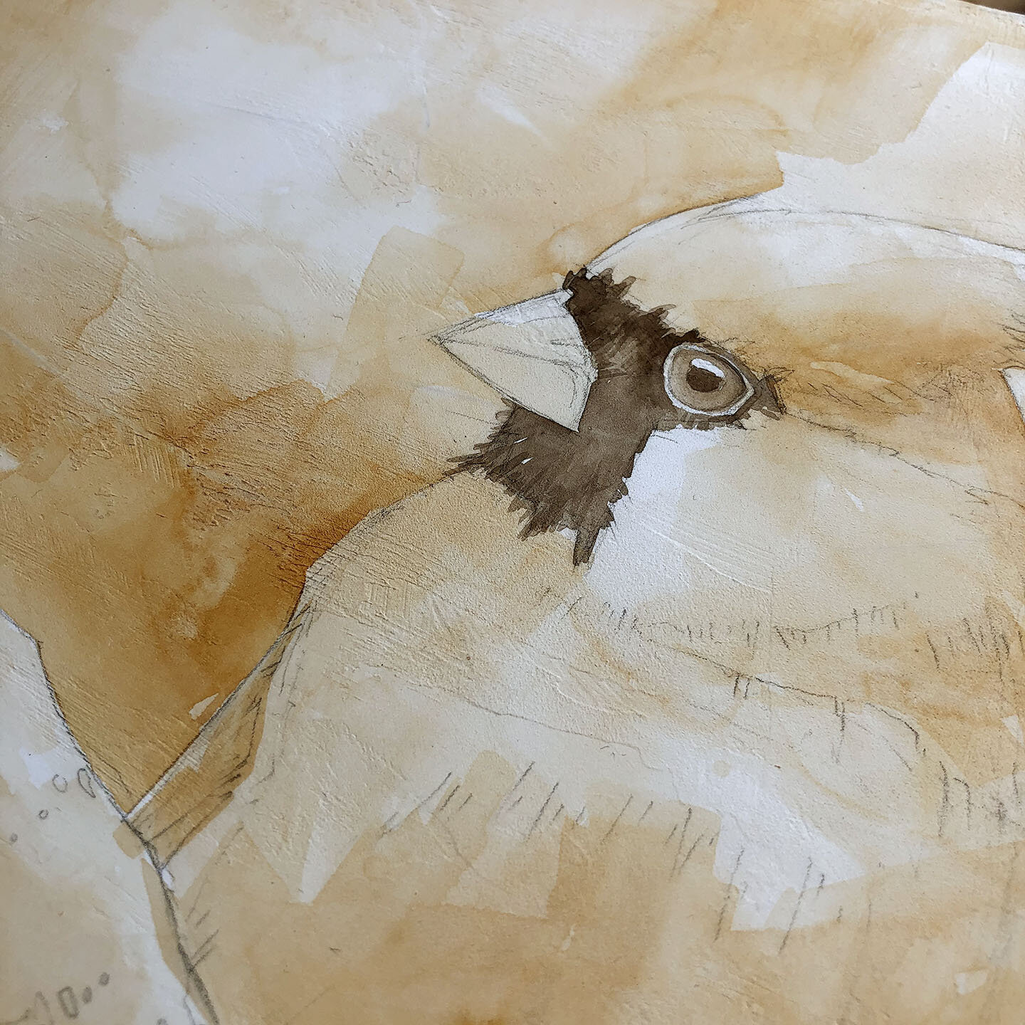
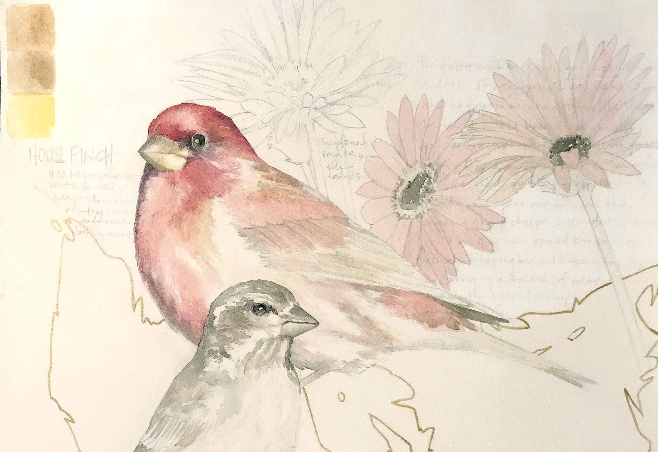
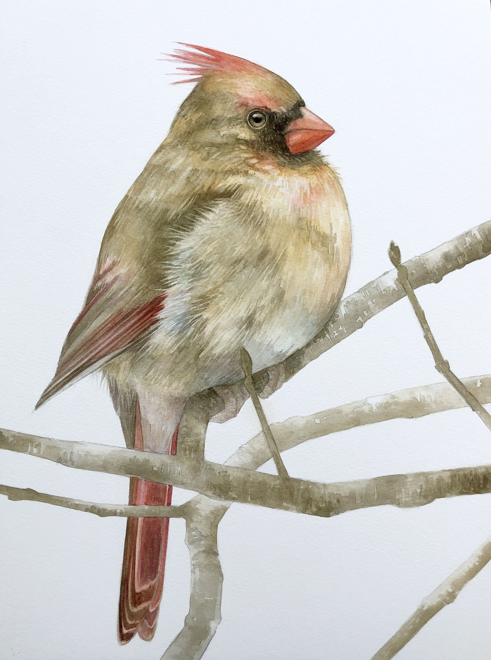
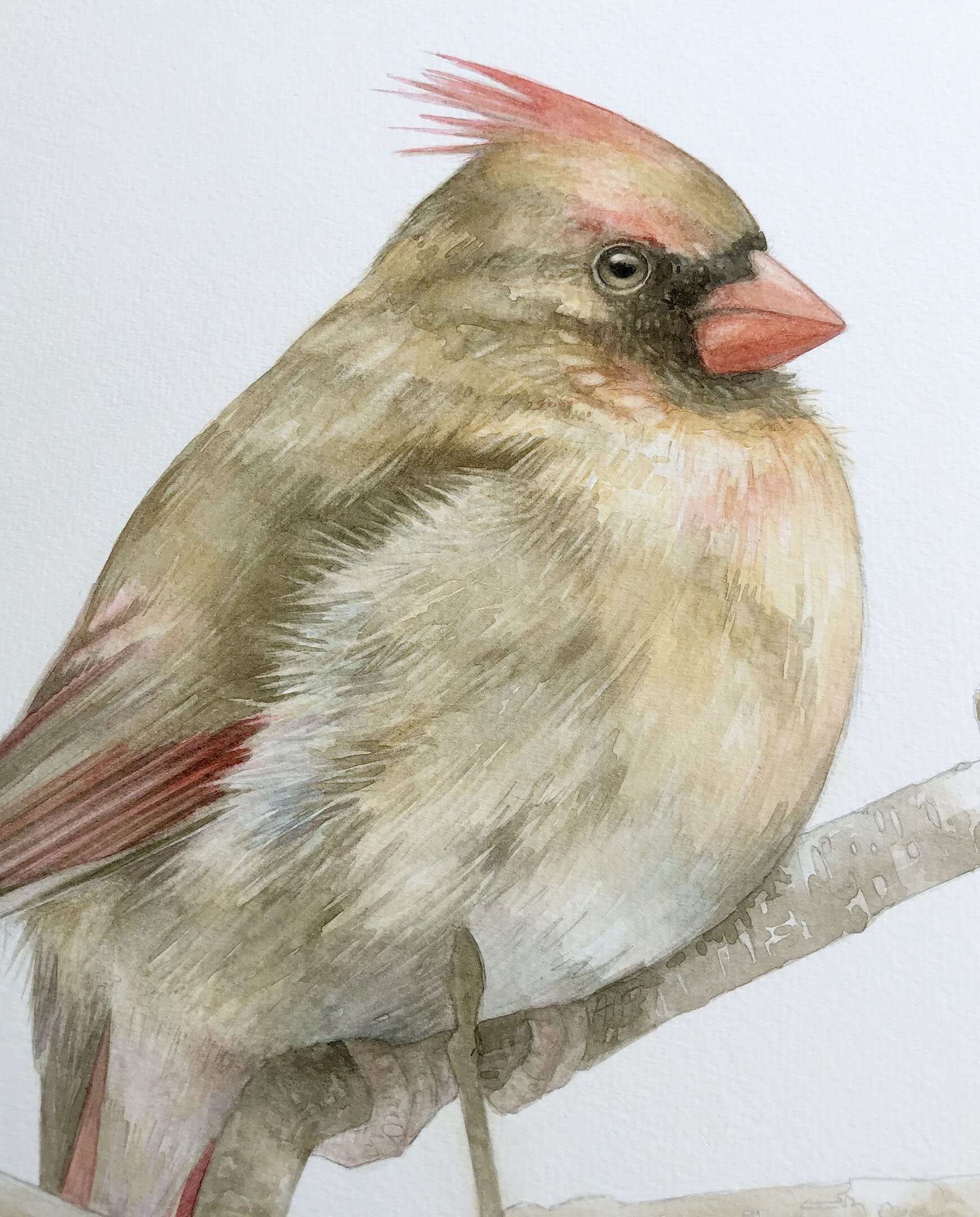
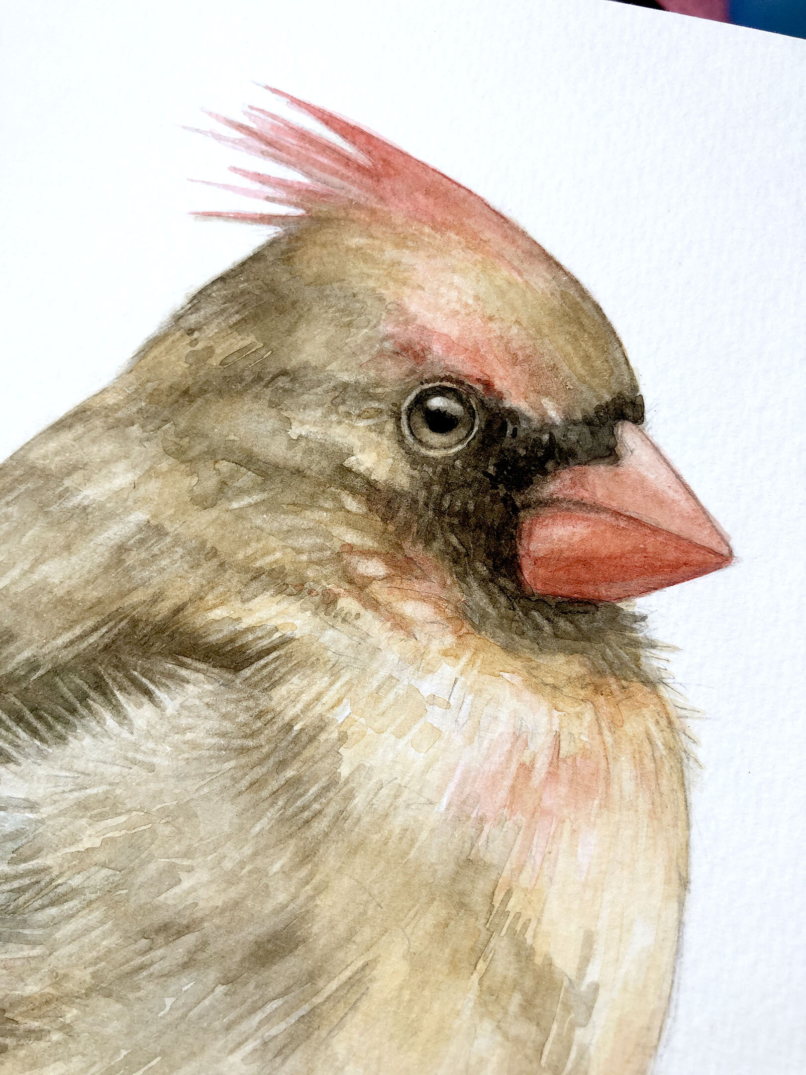
French Ochre Havane - from the French Earth collection, this color is a little lighter in value and rustier in color than a burnt sienna, I love using these specific earth pigments for bird paintings… thinking about “little brown birds” and all their varied browns!
There is a great overview of the French earths here: https://www.justpaint.org/18-new-williamsburg-oil-colors/ *this article is from 2012, note that French Cassel Earth and French Noir Indien have both been recently discontinued.

Stil de Grain - a course grind, synthetic iron oxide that I use as my secret weapon in a painting. It is great for glazing and has a gorgeous undertone

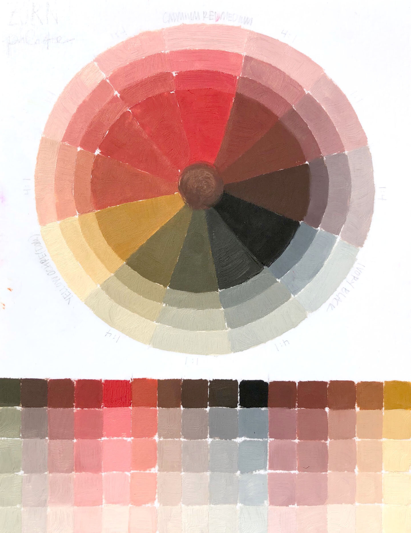
Paynes Grey (Violet) - a beautiful dark gray with a blackberry hued undertone. I love using this color as my dark neutral in a painting where there are a lot of reds (see below)

Cadmium Red Medium mixed 50/50 with Paynes Grey (Violet)

Graphite Grey - graphite ground into linseed oil, it feels like you are painting and drawing when you use it, it is fabulous. It is a very slow dryer at 14-21+ days estimated touch dry time, be sure to check out drying times of all the Williamsburg colors here: https://goldenhub.goldenpaints.com/storage/uploads/williamsburg-drytime-chart-091818.pdf
My sparkly colors were difficult to photograph well (I showed Iridescent Pale Gold and Interference Green), but here’s an article that gives an overview of the Iridescent and Interference colors: https://www.justpaint.org/not-all-that-glitters-is-gold-williamsburg-iridescent-and-interference-oil-colors/
Thanks so much for watching and looking, stay tuned for more live sessions - I’ll be back on the Williamsburg Oils Facebook page July 22 & 29 at 2pm EST both times and am scheduling out events for my Art by Amy Shawley Paquette page as well.